
Temperatures in the UK:
is it getting warmer?
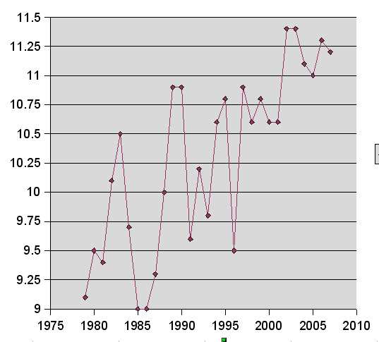
Here are mean annual temperatures from the Epping weather station in England, which has measured temperatures daily since 1979. The data are displayed on their website as monthly averages and annual averages.
EPPING MEAN ANNUAL TEMPERATURES, 1979-2007.
Vertical Axis is in degrees Centigrade.
CAMBRIDGE MEAN ANNUAL TEMPERATURES, 1959-2007.
Similar figures for the last 50 years from the weather station outside Cambridge, England.
Vertical Axis is in degrees Centigrade.
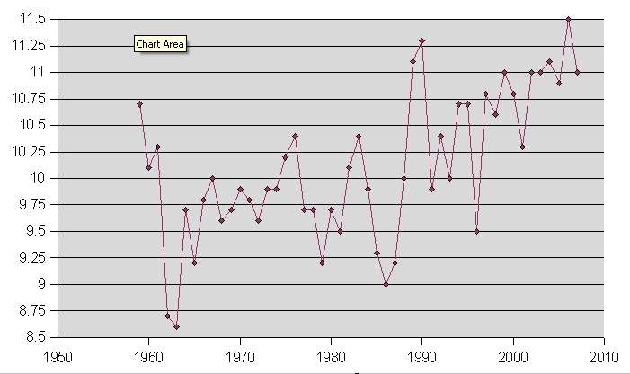
You can see that these graphs are inconclusive. It's not clear whether there's a warming trend or not, and in any case, readings from two small land-based weather stations in England are hardly the basis for deciding whether 'warming' is global or, indeed, whether it's happening at all. Temperatures since the year 2000 seem to have levelled off.
Graphs like this are being used by certain individuals to justify the spending of huge amounts of money on energy generation schemes which will not work or which are astronomically expensive.
It would be difficult to find a better way of destroying the profitability of our companies. One wonders if that is the intention.
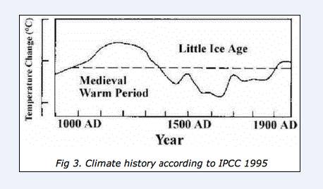
Here's a more useful graph from the Middlebury
website - a voice of sanity in a debate dominated by bad science and political pressure groups.
The graph (which is not disputed) suggests that climate change is something we must learn to live with, and that our money would be better spent in working out how.
big turbines
small turbines