
Al Gore's Graph:
Carbon Dioxide and Temperature
Here is a graphic made famous by the film 'An Inconvenient Truth'.
It shows how carbon dioxide levels have varied over the last 600,000 years, and how global temperature has varied over that time.
Al Gore has used the similarity between the two lines to prove to his satisfaction that CO2 drives temperature increases.
Unfortunately he has mixed up correlation and causation.
Let's have a closer look at the two lines ....
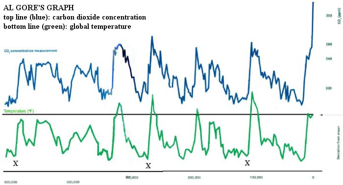
I have marked three points on the bottom graph. These are chosen because they are examples of when global temperatures started to rise.
Take the first cross. Construct a vertical line, upwards, until it goes through the 'carbon dioxide' graph.
The blue 'rise' is very slightly to the right of the cross. The blue line rises slightly later than the green line. Look at the second cross, and the third. They behave in exactly the same way.
It means that the temperature goes up before CO2 goes up.
This leads to an interesting conclusion:
The temperature rises above cannot be the result of CO2 buildup.
Therefore Al Gore's deduction - that global temperatures increase because CO2 increases - is false.
The graph is taken from a slide from Richard Lindzen's seminar at the House of Commons, 22 Feb 2012: Reconsidering the Climate Change Act - Global Warming: How to approach the science.
However, this does not mean that we have the right to continue using up finite resources - including fossil fuels - at the present rate. They belong to future generations as much as they belong to us.
habitat21
big turbines
small turbines